Loved by founders to ship UIs faster.
Loved by founders, engineers, and product leaders to ship UIs faster.
Patterns Showcase
Create from any design system, including your own.
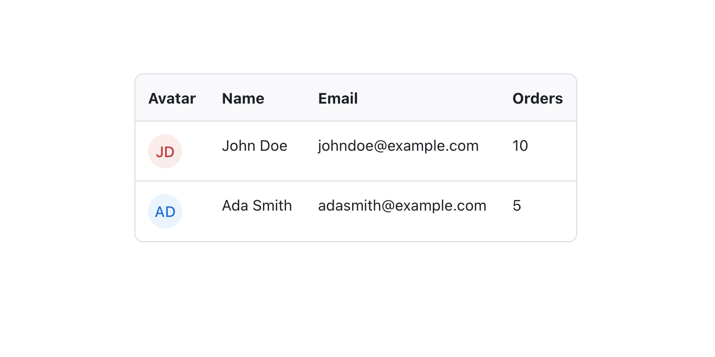
a list of to...
Radix Themes
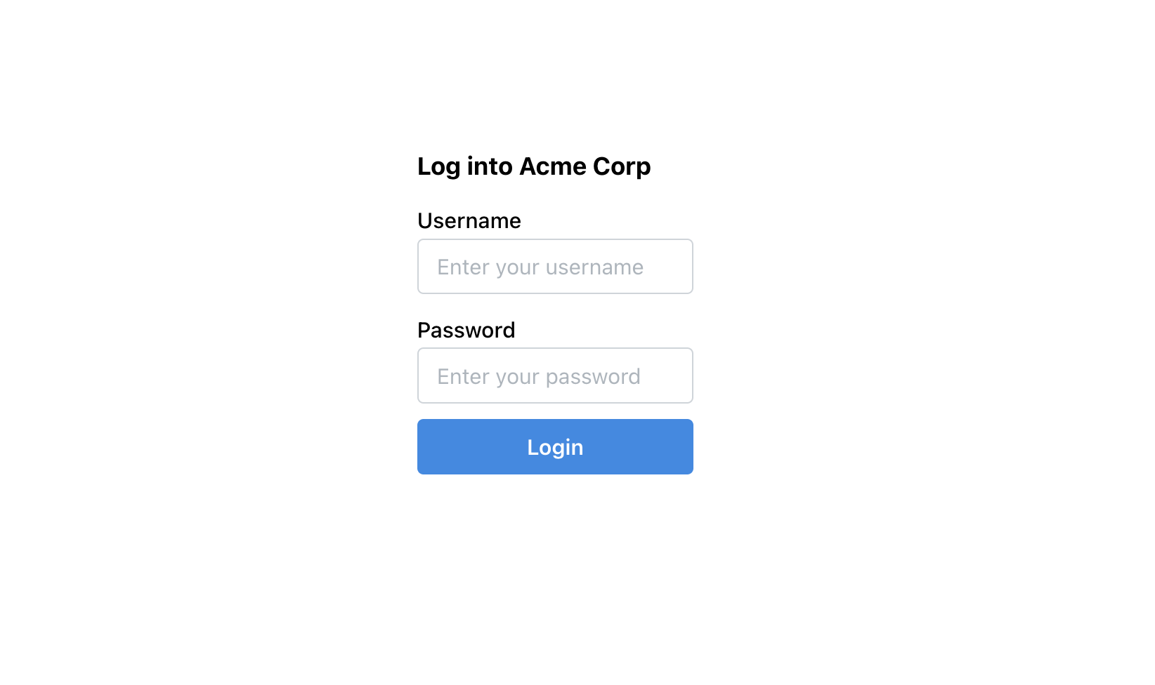
a simple log...
Mantine
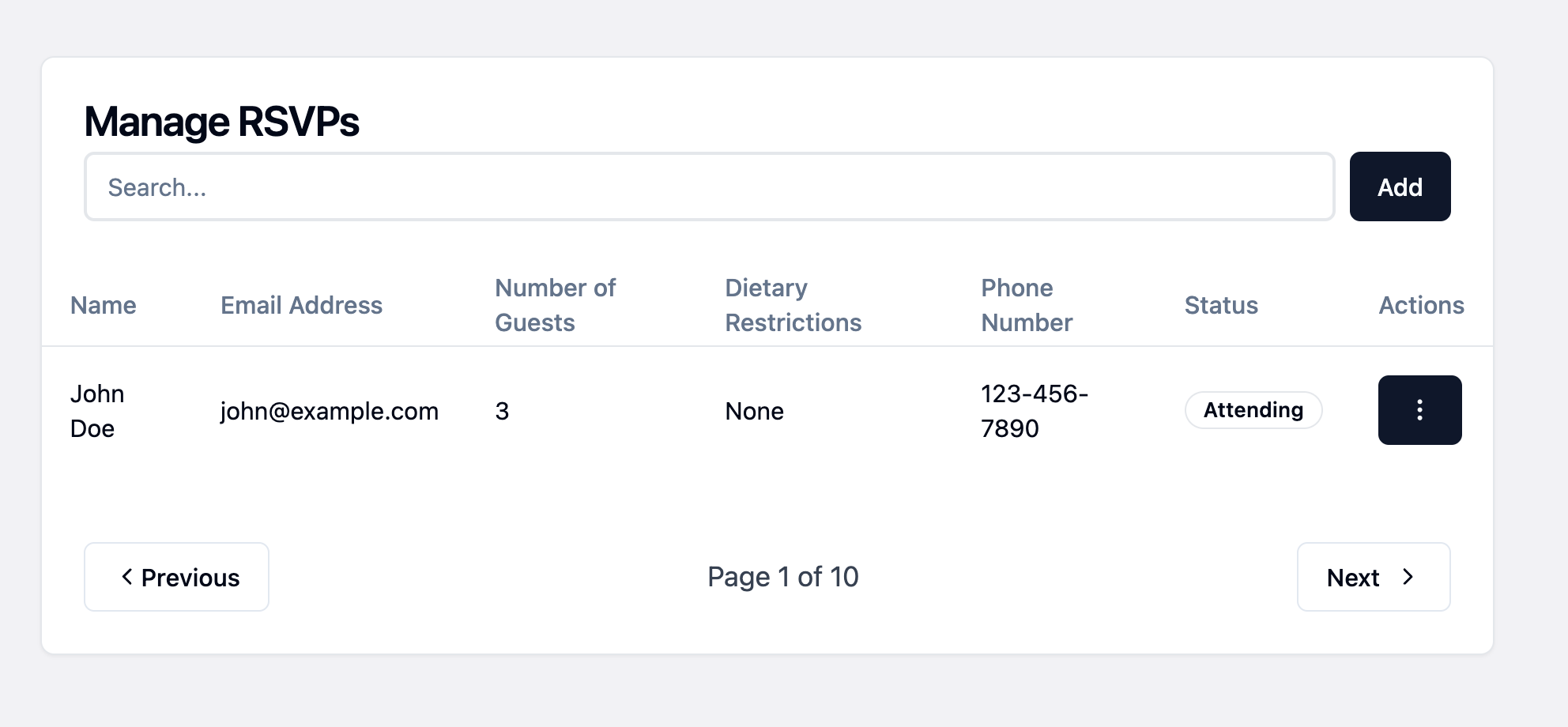
table for we...
Shadcn
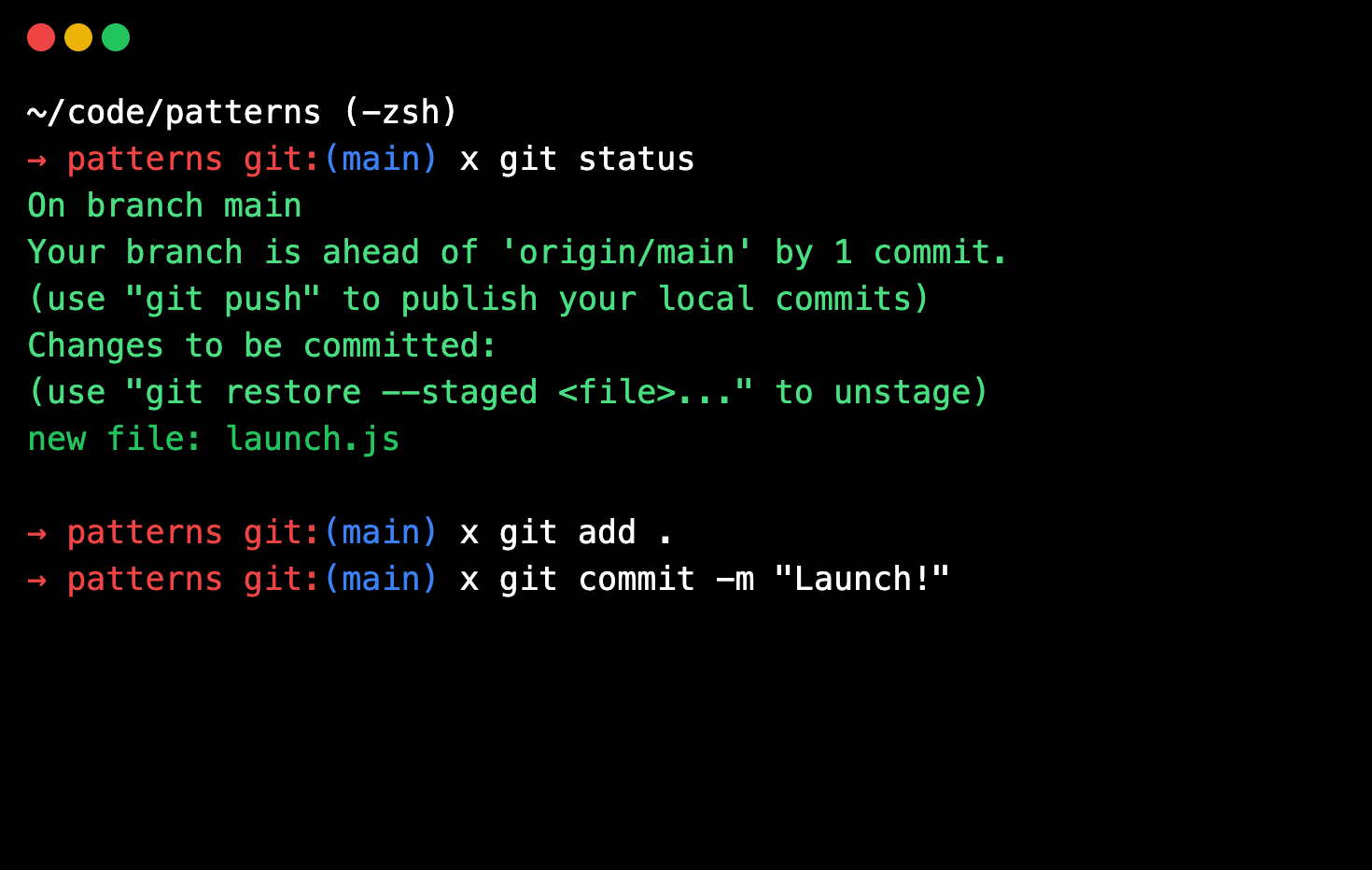
terminal win...
HTML
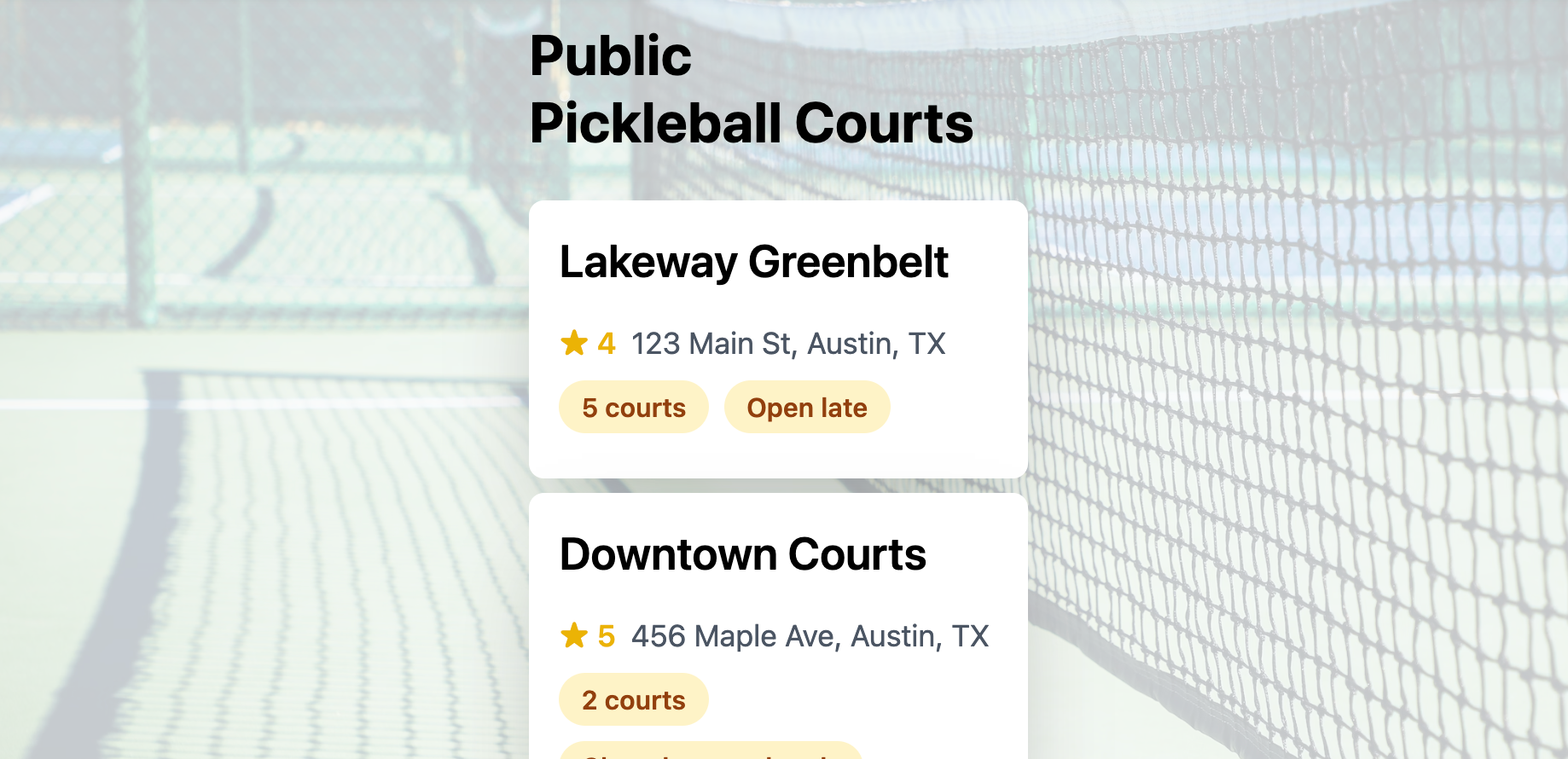
pickleball l...
HTML
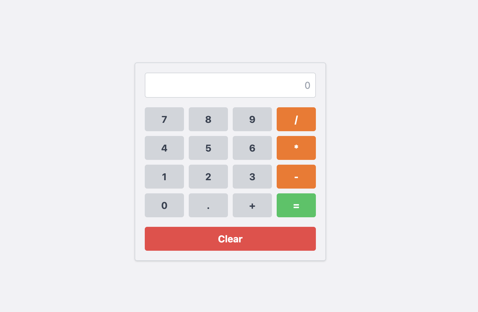
a working ca...
HTML
© North Park Labs 2024